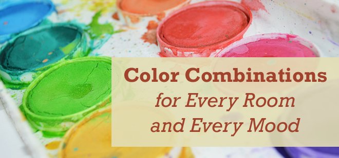
Timeless Color Combinations for Every Room
Have you ever walked into a room and felt overstimulated and on edge, even with no one else around? What could be causing such intense feelings? You may not realize it, but the colors we’re surrounded with have a way of influencing our moods and perceptions. They make us feel comfortable or anxious and affect how we perceive ourselves and others.
This phenomenon is referred to as color psychology. It describes how the brain and body react to certain tones. Artists and interior designers understand how colors impact moods and cause physiological reactions, such as increased blood pressure, decreased metabolism, or eyestrain. Many of these innate responses concern the cultural significance behind a specific color. Depending on the shade, warm colors (red, orange, and yellow) are perceived as warm or hostile, and cool colors (green, blue, and purple) can feel soothing or sad.
From the ancient Egyptians, who used colors in a healing practice called chromotherapy, to the modern day, humans have not taken the selection of shades lightly. Whether you’ve done it subconsciously or intentionally, the colors you pick to adorn yourself and your home have meaning. Creating a sense of harmony in your home often comes down to choosing a good color scheme. No matter your interior decorating style, these color combinations for every room will be compatible with any home!
Liven the Living Room
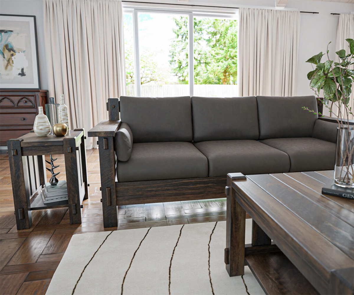
For many people, the living room is the heart of the home. It’s the social hub where family and friends come together to chat about life, enjoy entertainment as a group, or celebrate special occasions. The space should feel warm and inviting without inducing drowsiness or headaches.
Living room color combinations are possibly the most creative and versatile. It’s an area where you don’t have to be afraid to go bold and can pick colors that truly come alive. Combinations like –
- A variety of earthy greens and muted pink or orange
- Darker green paired with a nutty brown and a pastel yellow
- Jewel-toned blues/greens with lighter neutrals
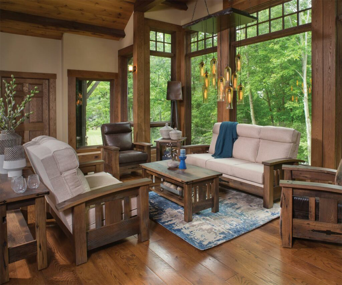
You may have noticed that variations of the color green appeared in all of our sample color schemes. This is because green is the easiest color on the eyes. However, if you’d rather not have green as the foundation of your room, a foolproof alternative is to use plant life in a neutral room and then add one bold color. You could anchor the living room with shades of gray or opt for the crispness of black and white. Then you can introduce a vivid, saturated color through smaller decorations, or one big statement piece.
Furnishings like your coffee table or bookcase can have a dark wood finish and still coordinate well because they blend in as neutrals. Lighter wood stains might not look as good, because the eye will read them in a different tone. Instead of fitting in with the black or gray decor, they will appear more brown or yellow.
Energize the Kitchen
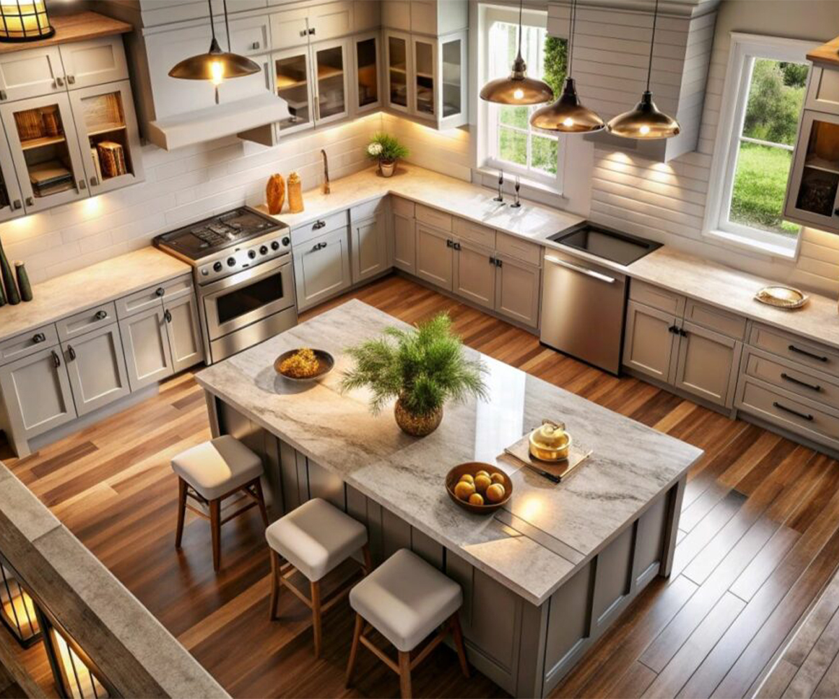
Aside from the living room, the kitchen is a shared place where the family comes together, often intersecting in a flurry of food and conversation. Far from solely a parent’s domain, it’s where meals are prepared, snacks are swiped, and lives are shared.
You need a cheery and productive color scheme for this environment. Dark hues risk making it feel too gloomy, but pale colors are too calm when considering the kitchen’s daily activity level. Oranges, yellows, and warm neutrals are ideal because they give off energy, happiness, and just the right amount of stimulation.
Suitable color combinations for a kitchen include, but are not limited to:
- Gold or butter yellow with deep browns
- Deep red paired with cream and olive green
- Gold and bright whites paired with a saturated color, such as navy blue
- Taupe, muted yellow, and sage green
As long as you avoid anything too lemony, the space will feel sunny and welcoming. If you have a wooden kitchen island or dining room cabinet, the finish should be orange or yellow to exude that same warmth.
Create a Soothing Bathroom
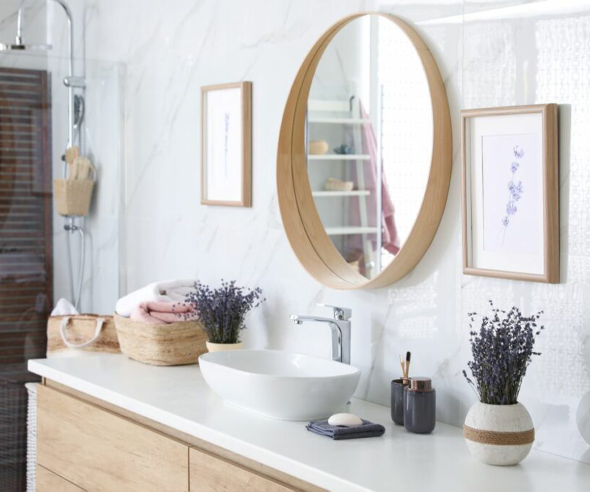
While you probably shouldn’t get too carried away decorating your bathroom, it’s still a living space where you should consider the mood you want to convey. After all, it’s often the room you visit first thing in the morning and right before bed at night. You don’t want a showy atmosphere or try too hard to wake up your senses in those situations.
Most of the color in your bathroom should be limited to an accent wall and your towels, rugs, or vanity. A general guideline to follow is the paler, the better. Your colors should make the space feel clean. We recommend you avoid Easter egg pastels and most yellows; otherwise, anything goes. Examples include:
- Gray and lavender
- “Linen white” and beige
- Washed out blue and navy
- Mint green and white
While only one of our combinations lists blues, this color is often the most recommended. It’s not too hard on the eyes and feels more soothing. (Think powder blue, wispy blue, slate blue, cloudy blue) Pair it with subtle grays for a calm and cool yet vaguely sophisticated vibe. You could insert a few accessories to tie the scheme together and install a bathroom vanity with a pale countertop.
Adorn the Dining Room
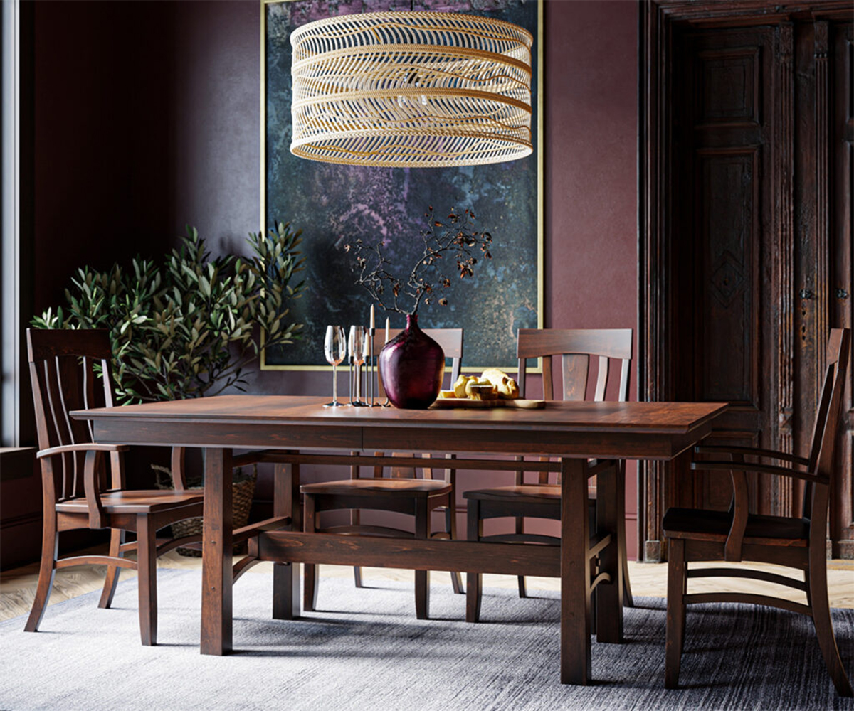
If your house includes a dining room, you’ll undoubtedly want to dress it up to be the gem of your home. This is the space for sitting up straight, dressing fashionably, and keeping elbows off the table. When your guests come in, you don’t necessarily want to inspire envy, but you want them to be quietly impressed with your décor.
Dining room color combinations are another area to seek out the middle ground. Make the space formal and elegant without feeling stuffy. This delicate balance comes into play when purchasing furniture, table linens, and window treatments, but it’s also a factor in your chosen color scheme.
Many contemporary dining spaces match deep, handsome colors with the neutrals beige, cream, and brown. It doesn’t matter if you pick bold colors for the walls and insert neutrals through your accessories, or vice versa. Some excellent ideas of what to pair with warm neutrals include:
- Velvety purple
- Spicy Orange
- Forest Green
- Rich Magenta
Your dining table, dining chairs, and wooden hutch should hone in on the hues of the neutrals in the room.
Your Master Bedroom Should Be A Retreat
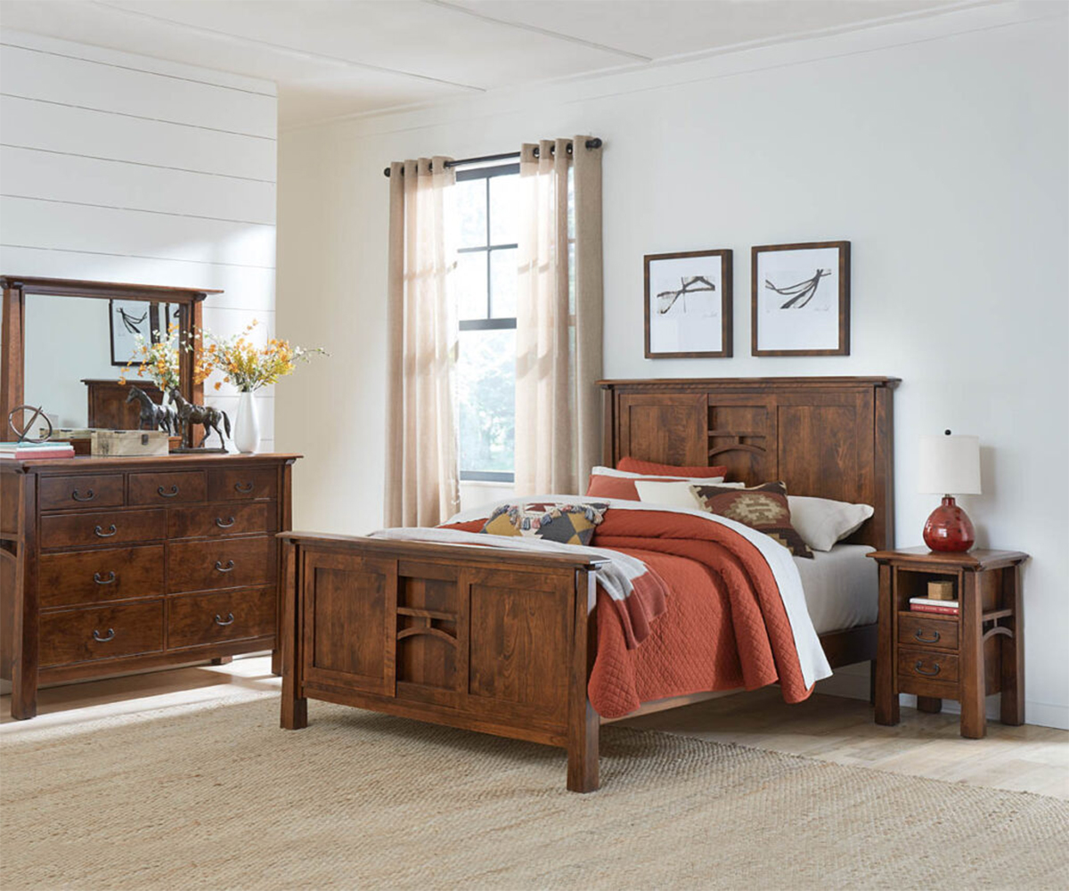
The master bedroom should be your sanctuary. Already draped with the softest linens and filled with luxurious details, it should be a sumptuous getaway with cozy and intimate colors to match. Such a statement is easier said than done, so here are a few ideas.
This is another place where you shouldn’t shy away from darker shades. Deep tones would work well in your bedroom, as long as you find more comforting colors than jarring. When paired with a single vibrant color, pastels can give your room an airy feel. The bedroom is a lot easier to be creative in your color pairings, but here are just a few ideas:
- Berry red, white, and chocolate brown
- Grayish browns with pastel blue and pink
- Pale greens and rusty browns
- Rich purple or blue with black and gray
- Burnt orange, cream, and dark brown or black
This combination will pick up the tones in your wooden furniture, so a solid wood bed with a warm finish is a great fit. A wooden dresser or nightstand should also have red undertones, but if you have a blanket chest or accent bench, it doesn’t need to match as strictly. Then you can inject pops of bright colors through accessories for a bit of personality.
Encourage Concentration in Your Workspace
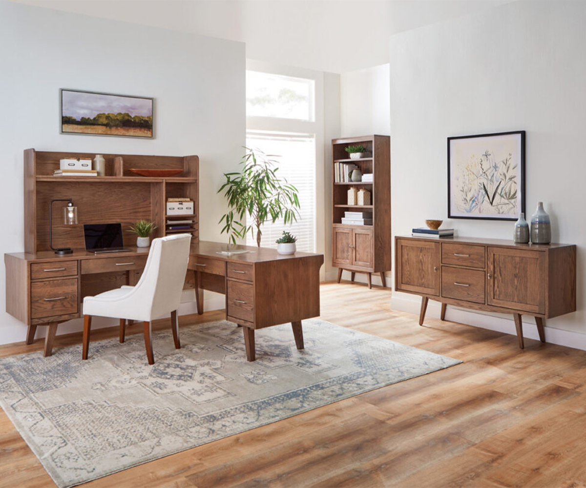
Whether you work from home and need a dedicated office or have decided to transform your extra room into a library, some spaces call for more focus and deep thinking. The color palette shouldn’t be distracting, but it should at least be enough to keep your brain awake and on-task.
So if colors shouldn’t be too bright, pale, or gloomy, where does that leave you? One option is to mix colors and neutrals for more understated shades. Aubergine is purple and black, mahogany is red and brown, and gray-green speaks for itself. Matching up any of these colors will promote productivity, concentration, and learning as soon as you walk in the door. Even the wood desk, bookcases, and office chair you select can mesh with the scheme.
Let Your Kids’ Rooms Be Colorful
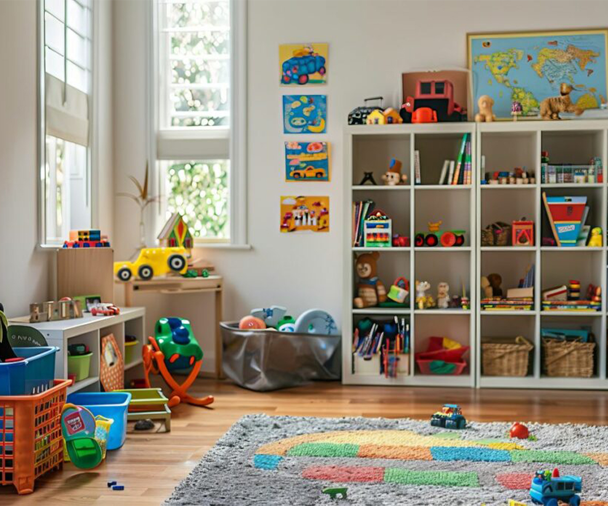
Just like your children, their rooms should feel young, playful, and fresh. You shouldn’t feel obligated to mirror interior design trends because doing so could turn what’s supposed to be their personal space into a place they can’t have fun. Your only concern should be reflecting their blossoming identities and letting their individuality shine!
Unless your child is an infant, you should try to think beyond blue and pink. Tap into their little personalities. What is it that they love best? Do they enjoy running around outside? Are they enamored with animals? Do they like pretending they have their own cooking show? Show them you care about their interests and give them a place to be themselves.
As you might imagine, the color combinations of kids’ rooms are often built upon a specific theme. Carefully selecting browns and greens will display their fondness for nature, or a nautical scheme of blue, white, and red will align with their fascination with dolphins and whales. The accessories you feature, such as artwork or toys, will further solidify the theme. Your children’s furniture doesn’t have to be perfectly coordinated — as long as it doesn’t stick out like a sore thumb compared to the style of the rest of the room, you’re fine.
Don’t Forget About the Basement
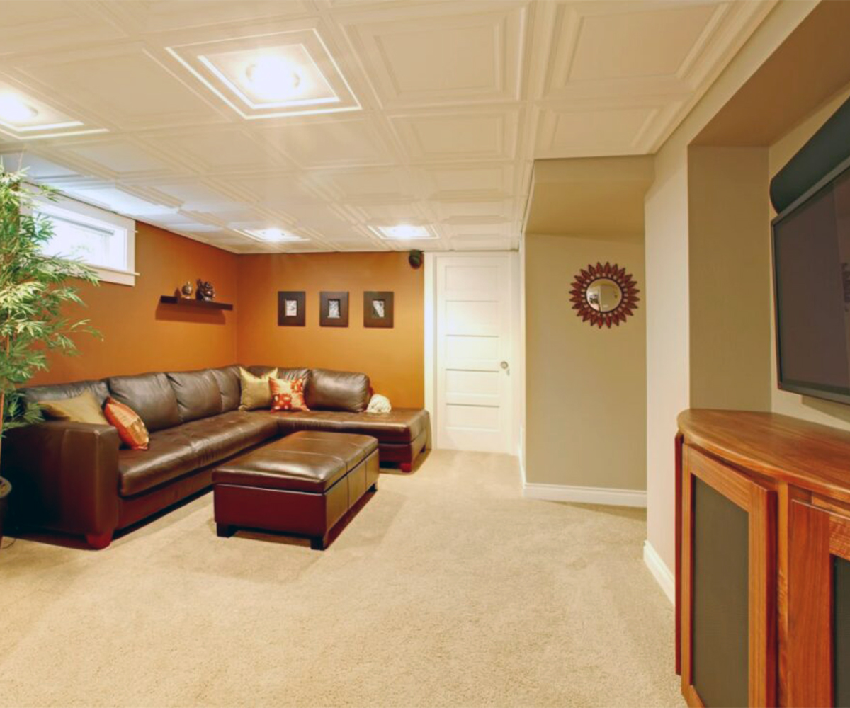
Ah, the basement. If yours is unfinished, you probably only use it for storage if you think about it at all. However, if your basement is finished, that’s another entire living space you could be utilizing! With a coat of paint and the right decor, it could become a game room, a crafting corner, a man cave, or anything else your heart desires.
So, what color should that coat of paint be? If it’s a basement without any windows, dark colors might not be the best choice. Instead of creating drama or intrigue, they’ll just give it the look of a cave. To make the area feel both spacious and inviting, choose light colors with an undertone of gray or beige that register like neutrals in your vision.
Going bright and bold in this extra room may be tempting, but it can be challenging to pull off. Some smart choices for hue on your palette include goldenrod, cloudy blue, yellow-green, or pale brick red. Then put grays or browns alongside them, or lighter shades of the same colors. Any upholstered furniture you bring downstairs can also have similar tones, but shouldn’t match too exactly.
Some Other Considerations
Don’t decorate each room in isolation if you want a good color flow in your home. Line up the color palettes you’re considering and shift some shades to create continuity. For instance, as mentioned before, you could select hues with similar undertones. Though they may not match on the surface, they’ll all feel like they belong together.
Trying to achieve color flow is the perfect excuse to use your favorite color more frequently in your home. For inspiration, look at your existing furnishings, fabrics, artwork, or accents. Then use lighter and darker shades of your preferred color throughout your home, thoughtfully determining how you’d like it to transition from room to room.
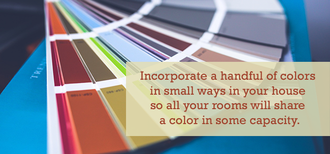
Don’t just slap one paint color on the walls and be done with it! Utilize tried and true color combinations on the main walls, ceiling, and trim. You could even consider adding an accent wall. The handful of colors you want to see repeated in your home can be alternated as primary, secondary, and accessory colors. Incorporate them in small ways through pillows, window treatments, wall stencils, or trinkets so all your rooms will share a color in some capacity.
Color Schemes for the Home
You don’t have to be an interior design expert to put together a good color combination. It’s all about knowing what you like, what provokes a certain mood, and what vibe you want to give each room. If you ever feel lost, there are even tools online that can help you discover unexpected color combinations you’ll love.
There are plenty of ways to bring color into a living space. You don’t have to buy a new paint can or swap out all the accessories to redecorate a room. Sometimes, all it takes is a bold piece of furniture to shift the tone of a space completely.
If you’re looking for high-quality, handcrafted furniture, look no further than AmishOutletStore.com. Our solid wood furniture is sturdy and uniquely beautiful, instantly upgrading whatever room it’s in.


 Are you a visual person? Check out our video to see how easy our process is!